Even though I am the first to admit that looks can be deceiving, sometimes they are dead-on accurate. When you stand in front of a house and observe the entire façade, the “face” of a house can often tell a story about the occupants inside.
The very shape of the house can resemble some of the varieties we see in a person’s face, from long and tall to short and wide. A roof can look like hair and the windows look like the eyes. A door can end up looking like either a nose or mouth.
When we see a house with a pretty façade, it is an indication that the owner has at least some of their life in order (as opposed to a very neglected house, where you can tell that the occupants are not keeping up with their responsibilities in life.) Something is chaotic and they are having many uphill battles.
If the landscape is overgrown and blocking light from entering the windows, it is like a disheveled and unshaven man who cares little for his appearance and has drawn himself too inward and has become depressed.
Cracks in the surrounding pavement and on the house itself can indicate the occupants are dealing with health issues.
If the door is not in clear view, but rather facing away from the street, this is somewhat like a person who is partially turned away. They are a more private person.
When standing at the street and looking straight at the house, if the right side of the house appears longer due to a slope in the street, then it indicates the man in the house is the boss and stronger than the woman. If the opposite side is longer in appearance, then it means the woman is the boss in the house.
There should be symmetry in the façade of the house, with the size of the door and windows in scale with each other. If the door is rounded or arched, then the windows should follow the pattern. If the door is rectangular, as most are, then the windows should not be rounded. The flow of energy inside and around the house should be consistent in order for the occupants to feel more comfortable and less stress.
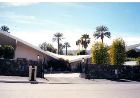
If the roof slopes downward towards the center of the house, as though something has crashed on it, then this is like a heavy weight about to collapse on a person’s head. This is not something that can only happen by accident or poor design. I once evaluated a famous Frank Lloyd Wright house that had this problem. (See photo at the top of this article)
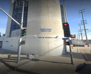
Commercial buildings can reveal similar information about their occupants or the type of service they provide. One very ironic building to look at in West Los Angeles (corner of Sepulveda and Olympic Boulevards) is the Edelman Westside Mental Health Center. See photo.

It is angled towards the intersection and has a very non-obvious orientation. You can’t tell right away where the front of the building really is. It appears to be confused, and disjointed, (not unlike some of the people who this building serves).
Author: Kartar Diamond
Company: Feng Shui Solutions ®
From the Architecture and Design Blog Series
